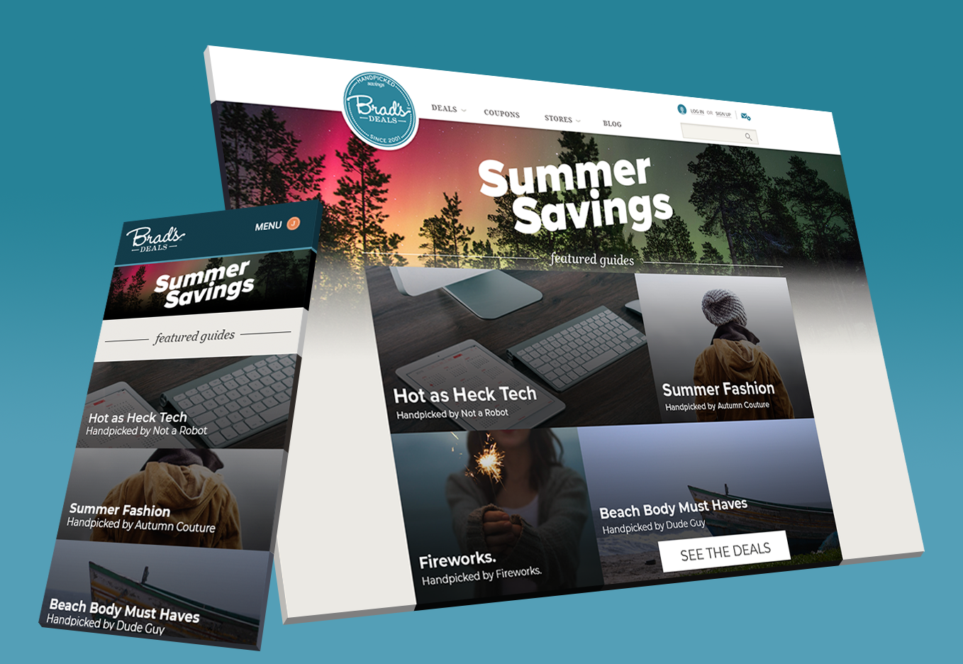
Final mockups of both desktop and mobile-responsive designs for Brad's Deals Shopping Guides page
My last few months as a Junior Designer at Brad's Deals I volunteered to lead the redesign of Brad's Deals new shopping guides page. I was in charge of the mockups, flow, and structure, along with creating an easy-to-follow system for our content creators to follow in order to get their posts and images into the shopping guides with little to no effort on the web developers' side.
Because we were designing this section of the website at the same time we were coming up with a new mobile responsiveness look to the website as a whole, I also was in charge of creating the overall responsive aspect of this section of the website.
The process took around 3 months of iteration before we settled on a final look. Today you can see the final product on their website. Based on how the design is upon writing this section, a lot of my original designs can still be seen on their site today.
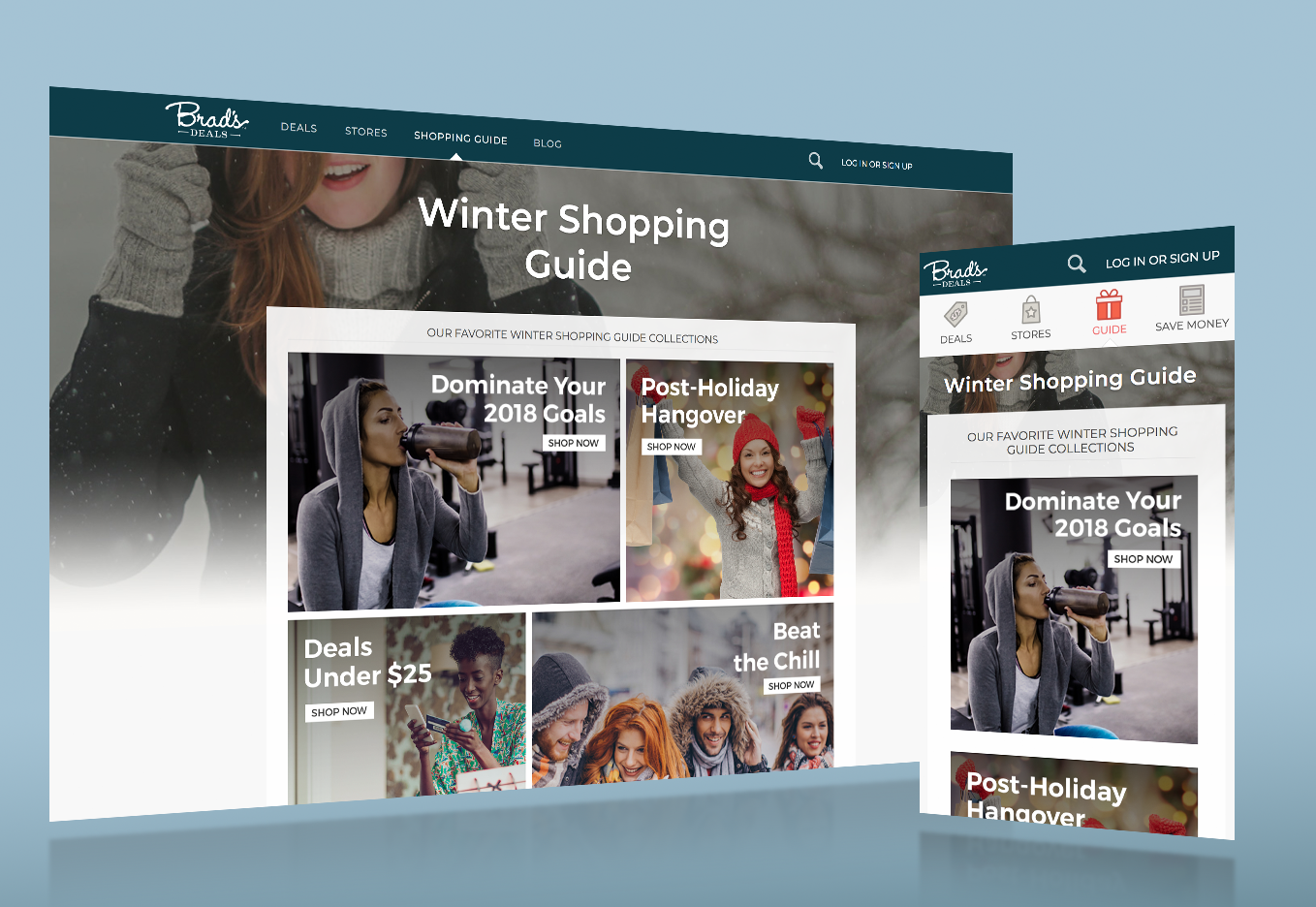
Live view of Bradsdeals.com guides page
More recently I helped with some wireframing and overall design roughs for a social network app focused on travel and planning trips. Here is a mock up I made for this project.